Is HIV under control?
UseR!2019 Datathon submission - 3rd place
In this document I present my analysis of the “Health, Nutrition and Population Statistics” dataset hosted by the World Bank Group. It was compiled from an RMarkdown file datathon2019.Rmd. A Shiny App showing the discussed topic and other visualizations can be accessed here. It’s a complementary material but it doesn’t replace this report. All the code that I used to build both the document and the application is available in this repository: github.com/violetr/health.
I analyzed the prevalence of HIV, paying special attention to risk areas. The results show good news regarding HIV control. It was also interesting to monitor the related indicators like knowledge about the virus and the progress regarding safe practices.
Introduction
Let’s get some information from Wikipedia about HIV/AIDS:
Acquired immune deficiency syndrome (AIDS) is a spectrum of conditions caused by infection with the human immunodeficiency virus (HIV). As the infection progresses, it affects more the immune system, increasing the risk of developing infections. Without treatment, average survival time after infection with HIV is estimated to be 9 to 11 years, depending on the virus subtype. HIV is spread primarily by unprotected sex, contaminated blood transfusions, hypodermic needles, and from mother to child during pregnancy, delivery, or breastfeeding. Safe practices include safe sex (using condom), needle exchange programs, treating mothers that are infected, and male circumcision.
Importing and tidying the data: considerations
First of all I had to import the data, I did this with the readr package. I chose to use the tidyverse environment instead of the data.table package because the computational needs were not too big and code is more readable with dplyr. Like that, don’t need to comment a lot the tidy scripts.
I manipulated the data with dplyr and tidyr to select the columns of interest for the analysis and to reshape the data into a tidy format. I show the main part of the manipulation whose most important part is the gather-spread that returns a database where indicators are the columns:
For some analyses I used the naniar package to visualize the presence of missing data because of the big amount of missing data for some indicators, countries and periods of time. I also used missMDA to impute missing values with the PCA method in some parts.
This is a table including all the available indicators that are directly related with the virus and the syndrome:
| indicator_name | series_code |
|---|---|
| Condom use, population ages 15-24, female (% of females ages 15-24) | SH.CON.1524.FE.ZS |
| Condom use, population ages 15-24, male (% of males ages 15-24) | SH.CON.1524.MA.ZS |
| Condom use at last high-risk sex, adult female (% ages 15-49) | SH.CON.AIDS.FE.ZS |
| Condom use at last high-risk sex, adult male (% ages 15-49) | SH.CON.AIDS.MA.ZS |
| Adults (ages 15+) living with HIV | SH.DYN.AIDS |
| AIDS estimated deaths (UNAIDS estimates) | SH.DYN.AIDS.DH |
| Women’s share of population ages 15+ living with HIV (%) | SH.DYN.AIDS.FE.ZS |
| Prevalence of HIV, total (% of population ages 15-49) | SH.DYN.AIDS.ZS |
| Children (0-14) living with HIV | SH.HIV.0014 |
| Prevalence of HIV, female (% ages 15-24) | SH.HIV.1524.FE.ZS |
| Comprehensive correct knowledge of HIV/AIDS, ages 15-24, female (2 prevent ways and reject 3 misconceptions) | SH.HIV.1524.KW.FE.ZS |
| Comprehensive correct knowledge of HIV/AIDS, ages 15-24, male (2 prevent ways and reject 3 misconceptions) | SH.HIV.1524.KW.MA.ZS |
| Prevalence of HIV, male (% ages 15-24) | SH.HIV.1524.MA.ZS |
| Antiretroviral therapy coverage (% of people living with HIV) | SH.HIV.ARTC.ZS |
| Adults (ages 15-49) newly infected with HIV | SH.HIV.INCD |
| Children (ages 0-14) newly infected with HIV | SH.HIV.INCD.14 |
| Incidence of HIV, ages 50+ (per 1,000 uninfected population ages 50+) | SH.HIV.INCD.50.P3 |
| Adults (ages 15+) and children (ages 0-14) newly infected with HIV | SH.HIV.INCD.TL |
| Incidence of HIV, all (per 1,000 uninfected population) | SH.HIV.INCD.TL.P3 |
| Young people (ages 15-24) newly infected with HIV | SH.HIV.INCD.YG |
| Incidence of HIV, ages 15-24 (per 1,000 uninfected population ages 15-24) | SH.HIV.INCD.YG.P3 |
| Incidence of HIV, ages 15-49 (per 1,000 uninfected population ages 15-49) | SH.HIV.INCD.ZS |
| Comprehensive correct knowledge of HIV/AIDS, ages 15-49, female (2 prevent ways and reject 3 misconceptions) | SH.HIV.KNOW.FE.ZS |
| Comprehensive correct knowledge of HIV/AIDS, ages 15-49, male (2 prevent ways and reject 3 misconceptions) | SH.HIV.KNOW.MA.ZS |
| Children orphaned by HIV/AIDS | SH.HIV.ORPH |
| Antiretroviral therapy coverage for PMTCT (% of pregnant women living with HIV) | SH.HIV.PMTC.ZS |
| Adults (ages 15+) and children (0-14 years) living with HIV | SH.HIV.TOTL |
There are also other less directly related indicators like general education and access to the health system.
Affected population and progression
How many people are living with HIV? How has this number evolved in the last 20 years?
Looking at the following plot showing the number of people in the world living with HIV can be really alarming:
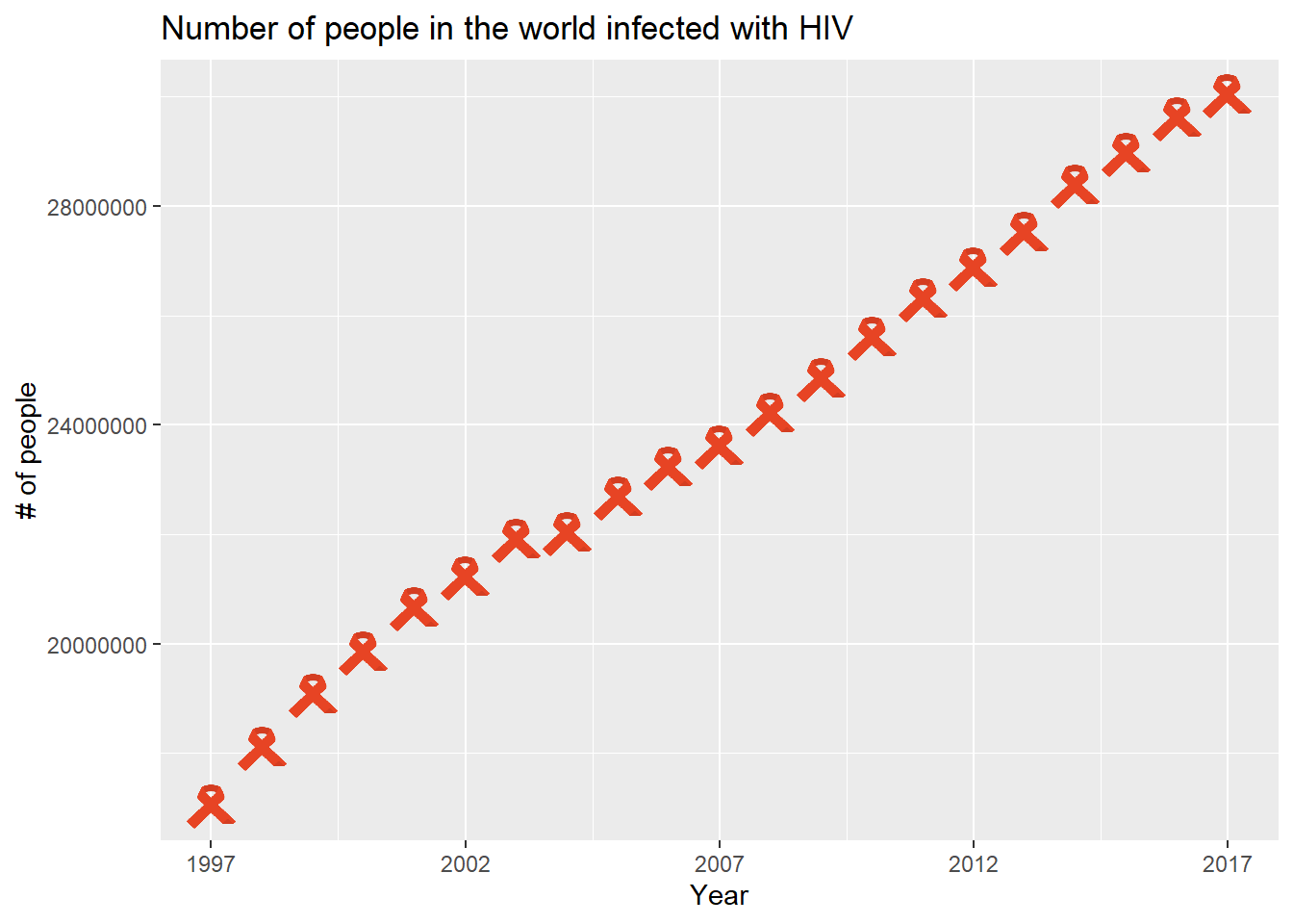
Infected population has been continuously growing in the last 20 years. But this other one looks much better:
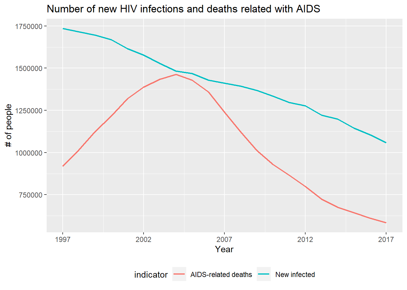
The number of new infections is decreasing and the number of deaths related with AIDS is also decreasing since 2005. In a sense the first graph shows good news, because infected population is living more years.
Let’s see an analysis by country.
Which countries are the most affected?
Let’s look at the percent of population living with HIV in 2017:
## # A tibble: 10 x 2
##    country_name      aids.prop
##    <chr>                 <dbl>
##  1 Eswatini              17.8
##  2 Botswana              17.2
##  3 Lesotho               16.3
##  4 South Africa          12.8
##  5 Zimbabwe               9.13
##  6 Namibia                8.32
##  7 Mozambique             7.33
##  8 Zambia                 7.12
##  9 Malawi                 5.66
## 10 Equatorial Guinea      4.60
Africa has been the most affected continent. It’s even clearer when we look the following interactive choropleth generated with leaflet:
The most affected area is in particular the South of Africa, with countries from the North of Africa with one of the lowest HIV-infection shares.
The Shiny App can be used to explore the choropleth for different HIV indicators and years.
How are countries grouped based on HIV indicators?
Let’s see how countries are grouped depending only on HIV related features. In order to do this I only considered the commensurable features, that is, relative values like percent or rates. Firstly, I embedded the dataset to 2D having into account HIV related features. Like that, I could visualize how countries group and see how clusters are related to the geographical location. I had to impute some missing values with the missMDA package prior to the embedding transformation.
UMAP is a new (2018) embedding algorithm that has a similar scheme to t-SNE, the well-known state of the art non-linear embedding algorithm. Their objective is to visualize high-dimensional datasets in 2D or 3D preserving neighborhoods in terms of distances. I decided to use it because it’s much faster than t-SNE and all algorithm decisions are mathematically justified.
Let’s see the resulting embedding for 2015:
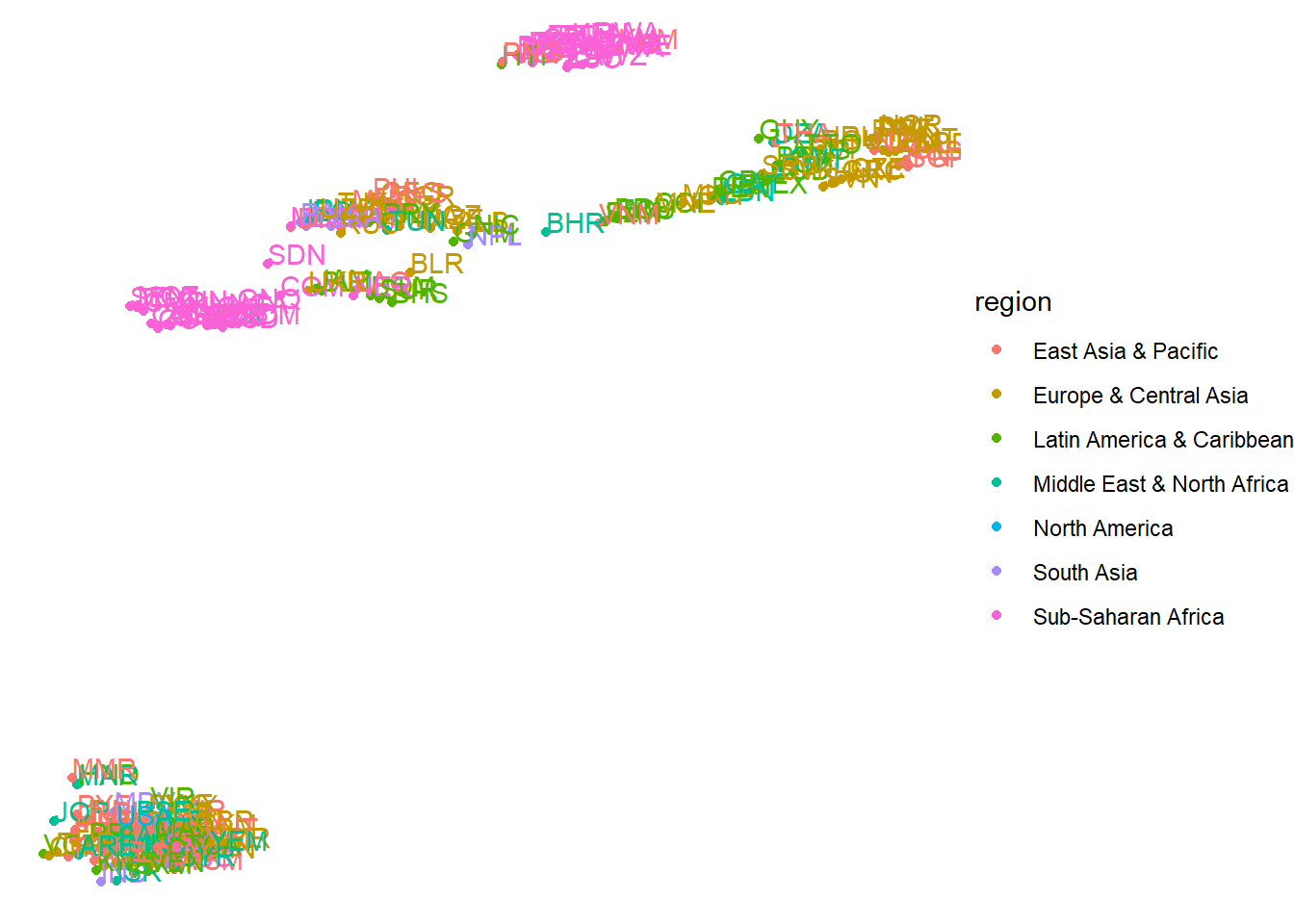
We can visualize 6/7 clear groups, two of which are composed only by African countries (pink groups). These two African groups are the most affected countries. All the other clusters have an heterogeneous composition in terms of continents.
Secondly, I clustered the embedded data with the HDBSCAN density-based clustering algorithm from the dbscan library.
I plotted the resulting clustering encoded with colors in the world map:
Like this, we can see the clusters from the embedding but in a more tidy way.
It’s interesting to compare to the same visualization from 20 years before:
All sub-Saharan African countries were in the same group before.
The shiny app can be used to explore how these plots change for different years.
Treatment, education and safe practices
The objective of this section is to monitor indicators that are directly related to the prevalence of HIV virus as the coverage of treatment: knowledge about the virus and the safe practices that act as prevent methods. Ideally we could validate the prevalence and incidence indicators with the evolution of these other indicators.
ART treatment
Antiretroviral treatment is the main therapy to fight the HIV infection. There is no cure or vaccine; however, antiretroviral treatment can slow the course of the disease and may lead to a near-normal life expectancy.
Some information about Antiretroviral treatment (ART) from avert.org:
ART works by keeping the level of HIV in your body low (your viral load). This lets your immune system recover and stay strong. Keeping your viral load low also helps to prevent HIV being passed on.
This means that the treatment positively affects non-only the number of AIDS-related deaths, but it also decreases the new infections.
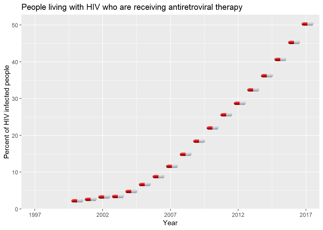
The increasing slope of the plot indicates that every year the good treatment coverage is increasing. Good news.
There is an important aspect to take care about: the health of pregnant women. Some information about the Prevention of mother-to-child transmission (PMTCT):
PMTCT programmes provide a range of services to women and infants. These include preventing HIV infections among women of reproductive age (15–49 years), preventing unwanted pregnancies among women living with HIV, and providing women living with HIV with lifelong ART to maintain their health and prevent transmission during pregnancy, labour and breastfeeding. PMTCT programmes also support safe childbirth practices and appropriate infant feeding, as well as providing infants exposed to HIV with virological testing after birth and during the breastfeeding period, ART for prevention and effective treatment. These actions can reduce the risk from 45% to below 5%.
Let’s look how the PMTCT coverage in Africa evolves:
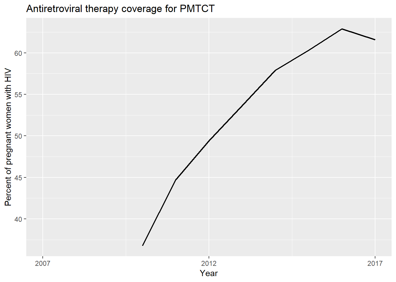
We can also visualize that mother treatment coverage is increasing since we start to have values. Let’s see how new children infections evolve:
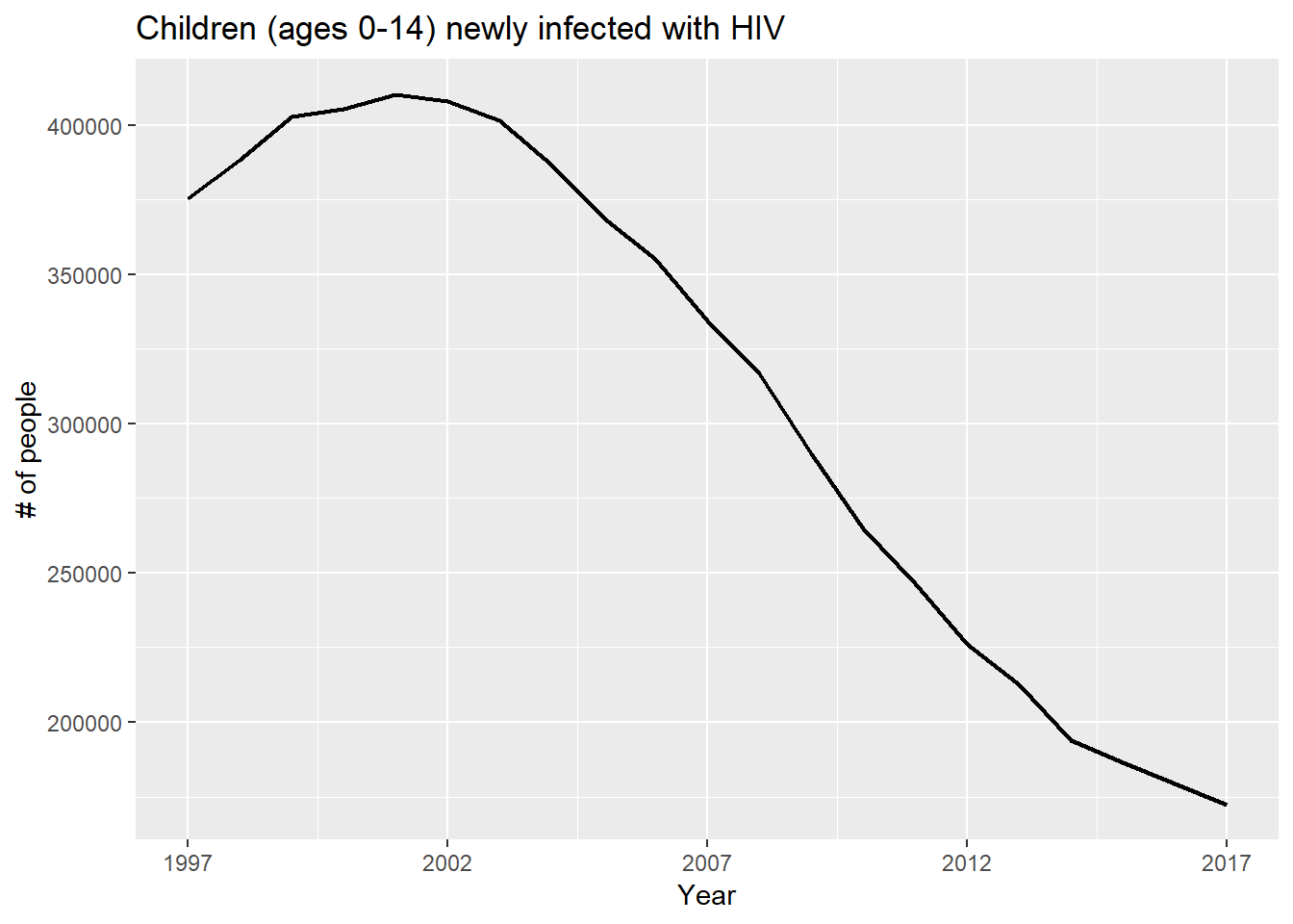 We can see that the closest in time the steeper the slope.
Knowledge about HIV
Of course education, and in particular HIV knowledge is highly related with the spread of the virus.
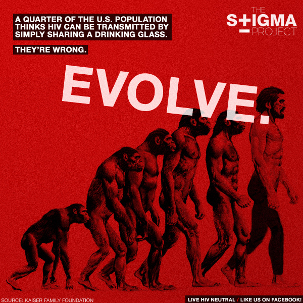


From Wikipedia: AIDS stigma exists around the world and it prevents many people from seeking HIV testing, returning for their results, or securing treatment, possibly turning what could be a manageable chronic illness into a death sentence and perpetuating the spread of HIV.
This is the why it is so important to provide good information to the people so that they know the actual methods of prevention and stop discriminating people living with HIV.
Let’s look at the percent of population that has reasonable knowledge about HIV. In this case, a person is considered to have knowledge about HIV if they correctly identify the two major ways of preventing the sexual transmission of HIV (using condoms and limiting sex to one faithful, uninfected partner), reject the two most common local misconceptions about HIV transmission, and know that a healthy-looking person can have HIV.
Even though this particular feature is really interesting, it was too difficult to analyze because of the huge proportion of missing values:
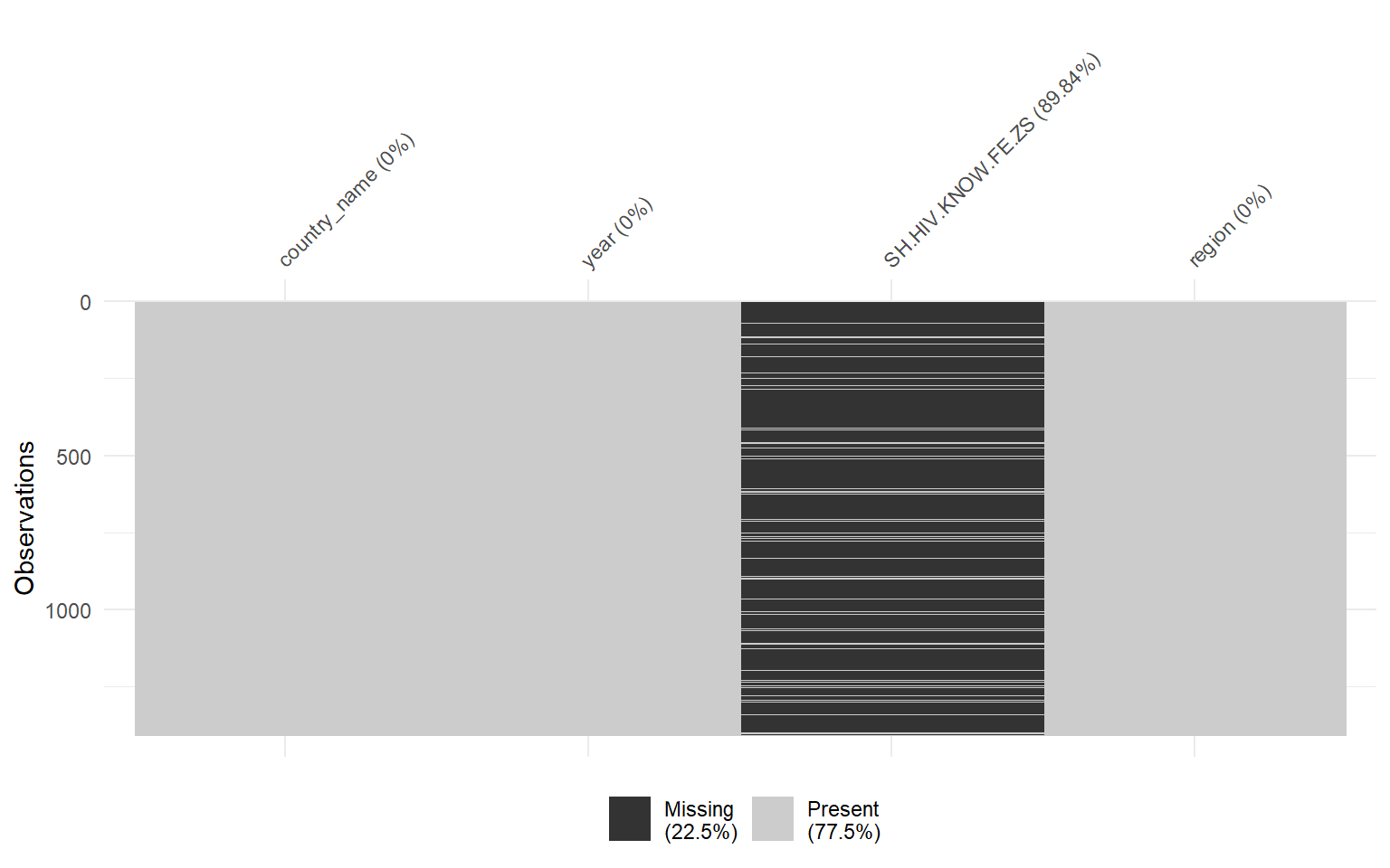
As I encountered difficulties because of of the missing data, I decided to plot the evolution of the variable for some of the countries from the risk area that had the biggest amount of measures:
I did the same for males and then plot them together:
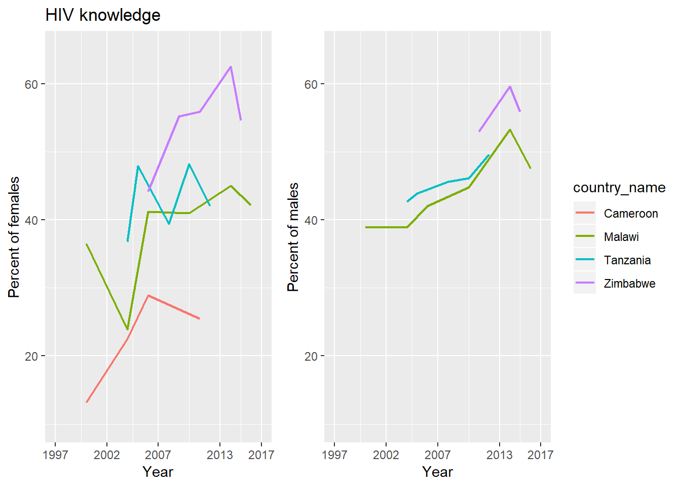
Looking at both charts I couldn’t affirm much about this indicator.
Use of condom
As I mentioned in the introduction the methods to prevent HIV infection are safe sex, not sharing needles and male circumcision. From all these prevention actions we have access to the safe sex practice indicator. This indicator measure the percent of the population (ages 15-49) who used a condom at last intercourse with a non-marital and non-cohabiting sexual partner in the last 12 months. Let’s see these indicator by gender:
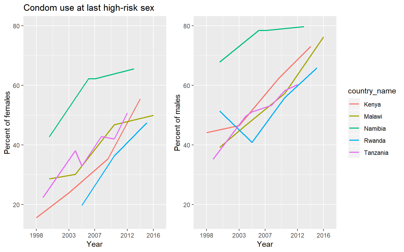
We observe an increasement in the percent for both available gender information. It is also important to notice that male values are in general much bigger than female values.
Conclusions
In this document we studied in general the prevalence of HIV in the world. We found that the number of new infections has been decreasing in the last 20 years. Also, the number of AIDS-related deaths did decrease since 2004. We realized that the most affected area is the South of Africa and realized that the north of Africa has one of the lowest prevalence of the virus of the world.
Regarding treatment, all plots show that the coverage percent of ART has increased. We couldn’t say much about the evolution of the knowledge about HIV because of the big proportion of missing data, but it seems to be increasing in the long term. Finally, we had good news about safe practices: the use of condom has been increasing during the studied period. The behavior of these features over the time is compatible with the prevalence evolution and it validates the strong correlation that they have.
Sources
- data.worldbank.org (Data)
- wikipedia.org (HIV/AIDS information)
- flaticon.com/free-icon/aids_119055 (aids riboon)
- avert.org (ART/PMTCT information)
- the stigma project (stigma images)
- IYO - clker.com (pill icon)